Wednesday, September 8, 2010
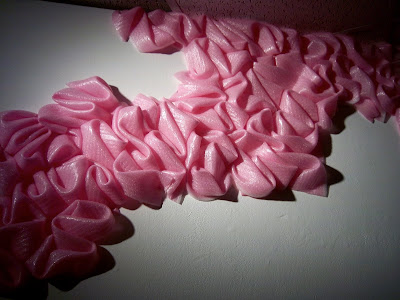
wall drawing
Last week we were setting up the student gallery, and naturally, being the beginning of the semester, there wasn't much work to be seen. My professor Herb had me rework the piece I designed for Redux last winter for the space, but there were still a number of blank walls. He was explaining to my classmate, Catherine (I wish she had a website for me to link because she's doing some really great stuff), that the student gallery should be a place for us to play, to experiment... and of course that got me thinking. It's something I've been wanting to explore for a while now. A new way of working more quickly and more intuitively. I like to think it's the start of something...


the big white guy... re-vamped
Last week I re-worked the piece I made for Redux last winter, Situation Ossification, so that it could fit into the CofC student gallery. This meant shaving off some length and width and re-shaping the contour, which proved to be a rather simple task. I worried about compromising the integrity of a site-based piece... perhaps I still do. But I'm glad it gets to have a longer life. And to reach a new audience.


Subscribe to:
Comments (Atom)

