Monday, January 31, 2011

speaking of reliefs: leslie wayne

It's almost ironic that I went to see this show at the Halsey yesterday... just after all my talk about sculptural wall reliefs. Leslie Wayne's 3-dimensional paintings are a perfect example of the other types of reliefs that I mentioned. They take painting to another level, making the canvas (or panel, in her case) a home for material exploration, a base off of which her thick and gloopy paints are built upon one another by a means that is much more sculptural than is painterly. Yet they are paintings... in every sense of the word.

These thick, layered works are composed solely of oil paint... lots of oil paint. In order to create such mind-boggling texture, Leslie Wayne manipulates the properties of paint by scraping, pulling, bunching, and folding the material. She describes herself as a "process painter," explaining "I may begin with a set of conditions, like a shaped panel for example, but then I take my cues from the working process." The exhibition includes a film revealing Leslie's process.
See the video HERE

Paintings of various shapes and sizes make up Leslie Wayne's solo exhibition in the spacious Halsey Institute of Contemporary Art. The ones that appeal to me most are those that are narrow and vertical (seen above). I enjoy the way the layers are piled atop of each other, thicker and heavier towards the bottom as if they are being squished by the weight above. These demonstrate Wayne's references to landscape in a manner akin to my professor, Jarod Charzewki's piled clothing installations (seen below).


Of all the pieces in the show, there was one that particularly stood out to me. It was the only one in which the paint stood alone, without a panel. This painting, seen below, is taking Wayne's reliefs into another realm. By removing the surface onto which the paint is ordinarily applied, the paint itself becomes the object. This idea of "art and objecthood" is something I am interested in exploring in my own work. More on that another day.

Leslie Wayne: Recent Work
will be on display at the Halsey Institute of Contemporary Art until March 12th...
don't miss it!

Saturday, January 29, 2011

thinking about reliefs

I've been thinking about sculptural wall reliefs lately. They sort of remind me of painting... this idea of being confined to the wall, particularly in a contained rectangular form. Of course, not all reliefs are rectangular, but the ones I have included in this post are. I think that by choosing to be contained both the rectangular wall on a rectangular surface, these sculptors are doing something quite interesting. It could be said that when a wall relief goes beyond the rectangle, it becomes an installation, but while on the surface, it remains an object. A 3-dimensional object that, unlike most, cannot be experienced "in the round."

The artists I've included in this post are all primarily sculptors that have confined themselves by making more or less 2-dimensional sculptures. Of course, there are also the painters (Yves Klein, Robert Ryman, etc.) who have chosen to go beyond the canvas by making 3-dimensional paintings. I think these would provide for an interesting comparison, but perhaps that is for another day...

Gunther Ueker

Lee Bontecou

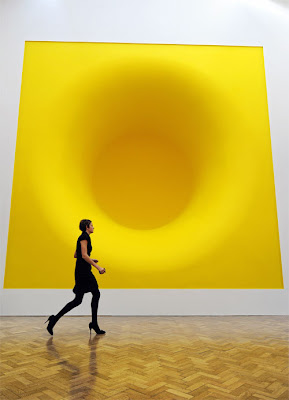
Anish Kapoor


Eva Hesse

Chakaia Booker

Kathy Kelly

Lauren Frances Moore

Friday, January 28, 2011

on public art and site-specificity

"... having lost its longstanding faith in the power of architecture and urban design to positively affect the quality of life in social terms, public art has reaffirmed its desire to impact the lives of (non-art) constituencies by other means. Instead of addressing the physical conditions of the site, the focus is now on engaging the concerns of those who occupy a given site."
This book has helped shape my understanding of site-specificity. I often refer to my installations as "site-specific" but I now see that this description is fully loaded and means much more than that the piece was designed for a specific physical location. I am making a point to catch my tongue and instead use terms like "site-based" and "site-responsive," which are, yes, very similar, but now seem better-suited to the type of work I'm doing.

I was excited to read, in this book, about Mary Jane Jacob's curatorial project, Places With a Past, an exhibition that took place in Charleston for the 1991 Spoleto Festival and is still being discussed today. The New York Times said the project may have been "the most moving and original exhibition of contemporary art in the United States" that season. Wow! Jacob brought big-time artists like Ann Hamilton and Antony Gormly to Charleston, which is cool enough on its own, but that fact that this show has had such an impact on site-specific art in general just makes it all the cooler.

Last year, I had the pleasure of meeting Mary Jane Jacob when she returned to Charleston to curate the Halsey's annual juried student show, Young Contemporaries. She is also on the sculpture faculty at the School of the Art Institute of Chicago.

Tuesday, January 25, 2011

vessel in the snow

My friend, and fellow Franconia intern, Julia Caston made it out to Franconia Sculpture Park this past week, despite the antarctic 40 below Minnesota weather! She and Mary Jane Mansfield (whom we also met this summer) trudged their way around the park in the knee-deep snow to take photos of our sculptures!

Here, Julia is cheesing it up in front of my sculpture, Vessel. She and Mary Jane are both from Minnesota, so they're used to this ridiculous weather. Below is an image of what she made at the park this summer... Maybe You Should Stop Buying So Much Crap

Wednesday, January 19, 2011

PINK: the exposed color of contemporary art & culture

I was very excited to finally receive this book in the mail a few days back. I've been thinking a lot about the color pink and its uses in my own work, so I was thrilled to find this book on the subject. This thick pink velvety book is made up primarily of images of, what else... pink art. I was a little underwhelmed by the small amount of writing found inside which consisted of a few essays, some better than others. The over-arching theme is that of the color pink's various contradictions. Barbara Nemitz pretty much sums this idea up in her introductory paragraph saying...

"The qualities we associate with the pastel color pink are quite diverse. They range from sensitive, tender, youthful, artificial or unreal to eccentric, vulnerable, and pleasurable. The color is at home in both "high" and "low" culture... What is unique about pink is that it is assertive in whatever context it appears."

She goes on to discuss the color's rare significance in nature and its ever-presence in and on our physical bodies, which are composed of all things pink. She also discusses the ephemerality of the color. "Pink is fleeting," she says, referring not only to the short life-span of blossoms on plants, but also more visceral things, like the blush of our cheeks.

In my work I've been thinking a lot about the color pink and it's significance in relation to my concepts. I like to think the the color's contradictory nature contributes to what I'm doing in my work. I like to create biomorphic forms that appear to be from nature, but constuct them in a way that is highly fabricated and man-made. This idea is furthered by the materials I choose, which tend to be synthetic and manufactured, yet somehow evoking the natural environment.

Enough about me. Here are some of my favorite images from the book...


Monday, January 17, 2011

tim hawkinson

I totally freaked out the other day when I stumbled upon these images in my own computer files. Apparently I found them, loved them, saved them, and forgot about them, and am just now rediscovering them. While I was working on the sculpture in the image below, I kept thinking that I had seen something like it before... but I just couldn't put my finder on it. I kept thinking Philip Guston, but no, that wasn't quite it.

detail of Objectified

It was Tim Hawkinson! Whoa... I just love these drawings of his! When I think of him, I often think of the Art:21 about him, which mainly focuses on his Uberorgan, a massive plastic pipe organ installation that he did for the Whitney Biennial. Though he works with a vast variety of materials on varying scales, most of Hawkinson's work seems to grab me in this way. Whether he's making miniature toenail sculptures (seen below) or massive noise-making balloons, his work all seems to relate back to the body in some way, taking the ordinary to new and unexpected realms.

Saturday, January 15, 2011

teaching classes at REDUX

This Spring I'll be teaching some youth classes at Redux Contemporary Art Center. I'm very excited to work with kids in this capacity. See my class descriptions below... or CLICK HERE to see all the other classes offered up this spring!


Sculpture Basics: Teaching Technique with Edible Materials (recommended for ages 7-13)

Wednesdays, 4pm - 5:30pm March 2 - 23
Instructor: Lauren Moore
Member $90 / Non-Member $110

Each week students will learn about a different fundamental sculpture technique, but with a yummy twist! We’ll mold bread dough, carve melons, cast chocolate, and more! Looking at classic artists and their traditional methods, we’ll talk about the basic elements of sculpture and see how contemporary artists are pushing the envelope with nontraditional materials, like food! Bring your appetite for art! Materials included.


Sculpture Basics: Possibilities of Plaster in 3 Dimensions
(recommended for ages 7 – 13)

Wednesdays, 4pm - 5:30pm
March 30 - April 20
Instructor: Lauren Moore
Member $90 / Non-Member $110

This four-week class will be an exploration of all the sculptural possibilities of that messy white stuff known as plaster. We’ll learn to mix it, pour it, carve it, turn it colors, build with it, and more! Students will be encouraged to use their creativity to construct original 3D forms while learning all the fun things that plaster can do! Materials and snacks included.

Thursday, January 13, 2011

teaching at REDUX

This Spring I'll be teaching some youth classes at Redux Contemporary Art Center. I'm very excited to work with kids in this capacity. See my class descriptions below... or CLICK HERE to see all the other classes offered up this spring!


Sculpture Basics: Teaching Technique with Edible Materials (recommended for ages 7-13)

Wednesdays, 4pm - 5:30pm March 2 - 23
Instructor: Lauren Moore
Member $90 / Non-Member $110

Each week students will learn about a different fundamental sculpture technique, but with a yummy twist! We’ll mold bread dough, carve melons, cast chocolate, and more! Looking at classic artists and their traditional methods, we’ll talk about the basic elements of sculpture and see how contemporary artists are pushing the envelope with nontraditional materials, like food! Bring your appetite for art! Materials included.


Sculpture Basics: Possibilities of Plaster in 3 Dimensions
(recommended for ages 7 – 13)

Wednesdays, 4pm - 5:30pm
March 30 - April 20
Instructor: Lauren Moore
Member $90 / Non-Member $110

This four-week class will be an exploration of all the sculptural possibilities of that messy white stuff known as plaster. We’ll learn to mix it, pour it, carve it, turn it colors, build with it, and more! Students will be encouraged to use their creativity to construct original 3D forms while learning all the fun things that plaster can do! Materials and snacks included.

Tuesday, January 11, 2011

the student-run gallery presents

This semester I've taken on the title of "Gallery Coordinator" for the Visual Arts Club's Student-Run Gallery. It's a nice visible space that has lots of potential which has been seriously underutilized this past year. It is my hope that, as the coordinator of this space, I can help to raise the bar a bit by showcasing the work of talented students through cohesive, curated exhibitions.


For our first exhibition of the semester, local artist Tim Hussey selected a body of work from the submissions we received. He titled the show "You're Going, You've Been" and said about it...

"This group of work seems to illustrate the basic elements of the human/animal experience, including: love, friendship, sacrifice, self-reflection, memory, loss and death.

The show includes work from the following students...

Bradford Walters
Taylor Stephenson
Caroline Echols
Catherine Dawson
Zac Mallard

The VAC Student-Run Gallery is located in the lobby hallway of the Simon's Center for the Arts just off of St. Philip Street on the CofC campus

Monday, January 10, 2011

tim hussey

The City Gallery at Waterfront Park is currently hosting local artist, Tim Hussey's first major solo exhibition, entitled "Drown Then Swim." The spacious 2-floor gallery is filled with Tim's paintings, most made in the past year or so, though there are some dating back to the onset of his fine art career in 2000. In the 1990's, after finishing his studies at RISD, Tim pursued a career as a highly sought after illustrator and art director in NYC for magazines like GQ and Business Week. But in 2000 he decided to make a break from his commercial career, move back down south (he grew up on Charleston), and begin working as a "fine" artist.

I could rattle on an on about Tim and how cool he is and how much I love his work, but it's all been said before. He's hot stuff right now. He's everywhere. The City Paper just featured him on the cover... read the article HERE.

Though Tim's work is unique and highly engaging, when looking at it, I can't help but think of several other artists. But in a good way. Tim often works on found grounds, like sheets of notebook paper and journal pages found at flea markets and such which reminds me a bit of James Castle. I've heard Tim talk about his love for folk art and its influence on his work.

I also can't help but think of Philip Guston when looking at some of Tim's more illustrative imagery. Some might say the resemblance is too close, but I'm all about some Guston... and I think what Tim is doing is quite different. Or at least different enough.

Tim Hussey on the left and Philip Guston on the right

Oh and by he way- Tim is also a talented photographer! He likes to take pictures as a hobby, he says. One day last year we got together and took some. This one was our favorite...

I encourage everyone in Charleston to check out "Drown Then Swim" in its last few days at the City Gallery. And if you're not local (and even if you are), try to get your hands on this documentary on him entitled Running by Sight. And DEFINITELY check out his website.

Tim Hussey, Running By Sight: A Visual Artist's Journey from Jewell&Ginnie on Vimeo.

james castle

Steve got this James Castle book for Christmas. It came with a documentary film which we watched a few days back. The Philadelphia Museum of Art organized a retrospective of his work in 2008. CLICK HERE to learn more about the exhibition.

This is another self-taught artist I've been looking at recently. Castle created drawings, assemblage and books throughout his lifetime. He was born profoundly deaf and it is not known to what extent he could read, write, or use sign language. His artworks were created almost exclusively with found materials such as papers salvaged from common packaging and mail, in addition to food containers of all types. I am particularly drawn to his more layered, almost 3D work, but enjoy his drawings as well. A few months ago I did an installation with recycled cardboard, which for some reason, has gotten me thinking more about a James Castle-like aesthetic in my own work, but only to an extent. (click here to see what I'm talking about)

Wednesday, January 5, 2011

fredrik soderburg

I really enjoy Fredrik Soderburg's illustrative watercolor paintings. They remind me of Henry Darger in a way. I think its the colors... and figurative imagery that seems to transcend our world.