I'm currently working on a collaboration with Gretchen McLaine, a dance professor at the College of Charleston. The product of our collaboration will be a dance piece that has been choreographed around a sculptural set that I have designed, in response to her concepts for the dance, dealing with darkness and light, shadows, etc.. The structure seen above is one of several elements that make up my contribution. It is an object of sorts that the dancers will interact with in a variety of ways. They will climb on it, inside of it, through it, pick it up, move it, hang from it, jump on it, off of it, and more! I'm very excited to see the end product... so far I have a really good feeling about how it is all coming together. The sculptures, the movements, the costumes, the lighting, the music... it's all working quite nicely! See the video below (from yesterday's rehearsal) for a rough sneak peek.
The performance will be the 19th-21st of March... more info to come!
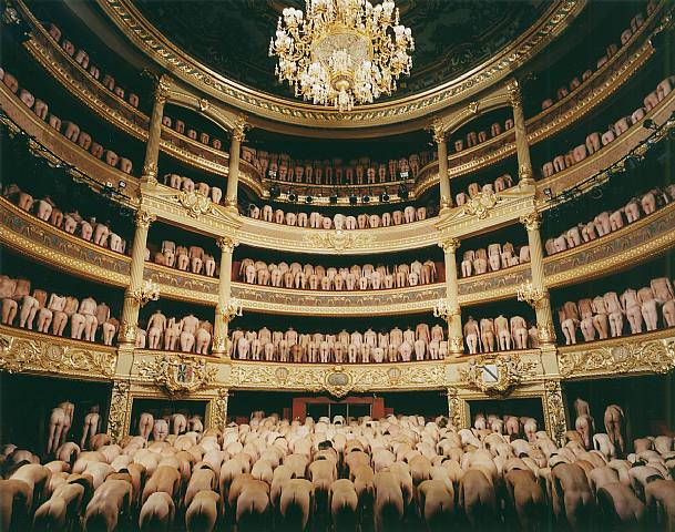
I recently watched one of the documentaries on photographer, Spencer Tunick. This one, called "Naked World," followed Spencer to all seven continents to photograph naked people in each. I've also seen "Naked States," in which he does the same in all 50 US states. A pretty neat idea, although I find the actual process and the final product to be much more interesting than the films.
Spencer Tunick's photographs serve as documentation for his site-specific installations of masses of naked people in public spaces. Though the photo itself is the end product, the art piece is made up of the entire event, which requires much planning and often turns into quite the production for all involved parties. It becomes a sort of performance, particularly in the way that it involves hundreds, often thousands, of participants.
Tunick states on his website that "the individuals en masse, without their clothing, grouped together metamorphose into a new shape. The bodies extend into and upon the landscape like a substance. These grouped masses which do not underscore sexuality become abstractions that challenge or reconfigure one's views of nudity and privacy."
I love the way he uses the flesh as raw material, as if the bodies are the blocks with which he is building.
His photos take on a wide range of aesthetics and emotions. Some are dark, others are humorous. Some are rigid, while others are amorphous. Some I enjoy more than others.
The time has come for me to suck it up and make a big girl website. I've finally set it up! This blog has served as my website for quite some time, but now I'm in need of something a bit more professional, and organized, and easier to navigate. Now I feel like I have more freedom to use this blog more to discuss my work and where it's taking me. But for now...
I've been thinking more about the flesh and its many material and metaphorical qualities. It's presence in my work has been unavoidable it seems these past few months. Even my abstract, nonrepresentational work seems to pick up on the aesthetic. In this series of small acrylic paintings I have zoomed in on various places on my own body (elbow, neck, palm, forehead, and stomach) and have simply painted what is there. This is a different approach than I normally take. Unlike my sculptures which tend to start out with abstract forms and often turn into something that evokes the natural environment, these paintings were derived from life, though they appear to be abstract. I think this is a fun way to play with the boundaries of representation as well as the boundaries of my own work. I'm having fun with painting and the more I paint, the more I see it fitting in with my wider body of work.
I never know what to think about Lynda Benglis. While her poured metal blobs render me breathless, her more colorful work leaves me somewhat indifferent. And then there's that scandalous Artforum ad. You type in her name on google, and that's what pops up... image upon image of the young, dildo-wielding Benglis. Sure, I get that she was making a statement about feminism and gender in art, particularly at that time (1974), but I'd much rather celebrate her for her more minimal object-based work. Despite the fact that most of her work is conceptually charged with gender and politics, I'm most attracted to it for its formal qualities.
I was first turned on to Lynda Benglis in an introductory foundry (metal pouring/casting) class at the College of Charleston. I was experimenting with loose blob-like forms cast in plaster (poured into condoms, which I suppose is rather ironic) which I eventually planned to cast in metal. My professor suggested I look at Benglis, as well as Louise Bourgeois to see how they dealt with the material in a similar aesthetic. What excites me about Benglis is her choice of materials and how process-oriented all her work is.
Laura Hopton of The New York Times says, "She adopted the vast scale and industrial materials favored by Minimalists like Donald Judd and Carl Andre, but let her colorful latex pouring allude to bodily gestures, fluids and topographies, and harden into a kind of skin."
YES PLEASE! It is in this way that I am interested in using similar types of man-made materials to create a sort of tactile, bodily, flesh-like aesthetic a la minimalist means.
As I mentioned, the more colorful stuff doesn't excite me as much... it reminds me too much of what Ben Godward (whom I met at Franconia this summer) is doing, thus I associate it with something different than perhaps is intended. Obviously, she did it first, but still... it kind of ruins it for me. I also can't help but think of Leslie Wayne (discussed in earlier post)... but I think I like Wayne's better. Anyway, I will continue praise Benglis for her use of materials and for her non-traditional approaches of handling them and will without a doubt continue drooling over her poured metal sculptures...
After further examining Felix Schramm's destruction-esque installations (pictured in previous post) I was turned onto Gordon Matta-Clark, often cited as one of Schramm's influences. Matta-Clark was an American architect turned artist best known for the site-specific artworks he made in the 1970s. He is famous for his "building cuts," a series of works in abandoned buildings in which he variously removed sections of floors, ceilings, and walls to create an experience that would alter the perception of the building and its surrounding environment.
For more traditional gallery settings, he would strategically install portions of cut up buildings in the gallery space, which, to me, come across as quite contemporary and particularly appealing, even today. But these types of installations are much more controlled and don't quite realize what Gordon Matta-Clark was trying to accomplish with his work. The fleeting and temporal nature of his most ambitious projects better communicate his "anarchitecture" ideals.
Matta-Clark once said that his work was ‘about making space without building it.’ I like this idea, and I appreciate the way he went about achieving it. Sort of. I guess you could say I have mixed feelings. I want to really like his massive demolitions of derelict buildings. It all really appeals to me aesthetically, but I can't help but wonder what would've become of his work had he not died of cancer at the young age of 35. I feel that, had he been able to continue working, he would've fallen into the same sort of trap as Le Corbusier and the other architects and ideals he so strongly opposed. You can't be a rebel forever. Either you get caught or people end up loving you, which means you're no longer against the norm. Luckily for him, Matta-Clark's career (and life) was as transient as his artworks, and so we can go on praising him for what he did best.
Gordon Matta-Clark has paved the way for artists such as Robert Wilson, who like Matta-Clark is addressing various architectural concerns in his work. The public art piece by Wilson, shown below, has been described as his "most radical intervention into architecture to date."
Formerly a Baroque castle, it is now a municipal museum for the exhibition of current art. I'd be really intrigued to see new, contemporary works displayed in such a historical setting. Unfortunately the museum's website is solely in German, and I've yet to find much info in a language I can comprehend, but the images I found on Contemporary Art Daily of the museum's current exhibition, "Neues Rheinland," have me itching to see more...
It's almost ironic that I went to see this show at the Halsey yesterday... just after all my talk about sculptural wall reliefs. Leslie Wayne's 3-dimensional paintings are a perfect example of the other types of reliefs that I mentioned. They take painting to another level, making the canvas (or panel, in her case) a home for material exploration, a base off of which her thick and gloopy paints are built upon one another by a means that is much more sculptural than is painterly. Yet they are paintings... in every sense of the word.
These thick, layered works are composed solely of oil paint... lots of oil paint. In order to create such mind-boggling texture, Leslie Wayne manipulates the properties of paint by scraping, pulling, bunching, and folding the material. She describes herself as a "process painter," explaining "I may begin with a set of conditions, like a shaped panel for example, but then I take my cues from the working process." The exhibition includes a film revealing Leslie's process.
Paintings of various shapes and sizes make up Leslie Wayne's solo exhibition in the spacious Halsey Institute of Contemporary Art. The ones that appeal to me most are those that are narrow and vertical (seen above). I enjoy the way the layers are piled atop of each other, thicker and heavier towards the bottom as if they are being squished by the weight above. These demonstrate Wayne's references to landscape in a manner akin to my professor, Jarod Charzewki's piled clothing installations (seen below).
Of all the pieces in the show, there was one that particularly stood out to me. It was the only one in which the paint stood alone, without a panel. This painting, seen below, is taking Wayne's reliefs into another realm. By removing the surface onto which the paint is ordinarily applied, the paint itself becomes the object. This idea of "art and objecthood" is something I am interested in exploring in my own work. More on that another day.
Leslie Wayne: Recent Work
will be on display at the Halsey Institute of Contemporary Art until March 12th... don't miss it!
I've been thinking about sculptural wall reliefs lately. They sort of remind me of painting... this idea of being confined to the wall, particularly in a contained rectangular form. Of course, not all reliefs are rectangular, but the ones I have included in this post are. I think that by choosing to be contained both the rectangular wall on a rectangular surface, these sculptors are doing something quite interesting. It could be said that when a wall relief goes beyond the rectangle, it becomes an installation, but while on the surface, it remains an object. A 3-dimensional object that, unlike most, cannot be experienced "in the round."
The artists I've included in this post are all primarily sculptors that have confined themselves by making more or less 2-dimensional sculptures. Of course, there are also the painters (Yves Klein, Robert Ryman, etc.) who have chosen to go beyond the canvas by making 3-dimensional paintings. I think these would provide for an interesting comparison, but perhaps that is for another day...
"... having lost its longstanding faith in the power of architecture and urban design to positively affect the quality of life in social terms, public art has reaffirmed its desire to impact the lives of (non-art) constituencies by other means. Instead of addressing the physical conditions of the site, the focus is now on engaging the concerns of those who occupy a given site."
This book has helped shape my understanding of site-specificity. I often refer to my installations as "site-specific" but I now see that this description is fully loaded and means much more than that the piece was designed for a specific physical location. I am making a point to catch my tongue and instead use terms like "site-based" and "site-responsive," which are, yes, very similar, but now seem better-suited to the type of work I'm doing.
I was excited to read, in this book, about Mary Jane Jacob's curatorial project, Places With a Past, an exhibition that took place in Charleston for the 1991 Spoleto Festival and is still being discussed today. The New York Times said the project may have been "the most moving and original exhibition of contemporary art in the United States" that season. Wow! Jacob brought big-time artists like Ann Hamilton and Antony Gormly to Charleston, which is cool enough on its own, but that fact that this show has had such an impact on site-specific art in general just makes it all the cooler.
My friend, and fellow Franconia intern, Julia Caston made it out to Franconia Sculpture Park this past week, despite the antarctic 40 below Minnesota weather! She and Mary Jane Mansfield (whom we also met this summer) trudged their way around the park in the knee-deep snow to take photos of our sculptures!
Here, Julia is cheesing it up in front of my sculpture, Vessel. She and Mary Jane are both from Minnesota, so they're used to this ridiculous weather. Below is an image of what she made at the park this summer... Maybe You Should Stop Buying So Much Crap
I was very excited to finally receive this book in the mail a few days back. I've been thinking a lot about the color pink and its uses in my own work, so I was thrilled to find this book on the subject. This thick pink velvety book is made up primarily of images of, what else... pink art. I was a little underwhelmed by the small amount of writing found inside which consisted of a few essays, some better than others. The over-arching theme is that of the color pink's various contradictions. Barbara Nemitz pretty much sums this idea up in her introductory paragraph saying...
"The qualities we associate with the pastel color pink are quite diverse. They range from sensitive, tender, youthful, artificial or unreal to eccentric, vulnerable, and pleasurable. The color is at home in both "high" and "low" culture... What is unique about pink is that it is assertive in whatever context it appears."
She goes on to discuss the color's rare significance in nature and its ever-presence in and on our physical bodies, which are composed of all things pink. She also discusses the ephemerality of the color. "Pink is fleeting," she says, referring not only to the short life-span of blossoms on plants, but also more visceral things, like the blush of our cheeks.
In my work I've been thinking a lot about the color pink and it's significance in relation to my concepts. I like to think the the color's contradictory nature contributes to what I'm doing in my work. I like to create biomorphic forms that appear to be from nature, but constuct them in a way that is highly fabricated and man-made. This idea is furthered by the materials I choose, which tend to be synthetic and manufactured, yet somehow evoking the natural environment.
Enough about me. Here are some of my favorite images from the book...
I totally freaked out the other day when I stumbled upon these images in my own computer files. Apparently I found them, loved them, saved them, and forgot about them, and am just now rediscovering them. While I was working on the sculpture in the image below, I kept thinking that I had seen something like it before... but I just couldn't put my finder on it. I kept thinking Philip Guston, but no, that wasn't quite it.
It was Tim Hawkinson! Whoa... I just love these drawings of his! When I think of him, I often think of the Art:21 about him, which mainly focuses on his Uberorgan, a massive plastic pipe organ installation that he did for the Whitney Biennial. Though he works with a vast variety of materials on varying scales, most of Hawkinson's work seems to grab me in this way. Whether he's making miniature toenail sculptures (seen below) or massive noise-making balloons, his work all seems to relate back to the body in some way, taking the ordinary to new and unexpected realms.
 I'm currently working on a collaboration with Gretchen McLaine, a dance professor at the College of Charleston. The product of our collaboration will be a dance piece that has been choreographed around a sculptural set that I have designed, in response to her concepts for the dance, dealing with darkness and light, shadows, etc.. The structure seen above is one of several elements that make up my contribution. It is an object of sorts that the dancers will interact with in a variety of ways. They will climb on it, inside of it, through it, pick it up, move it, hang from it, jump on it, off of it, and more! I'm very excited to see the end product... so far I have a really good feeling about how it is all coming together. The sculptures, the movements, the costumes, the lighting, the music... it's all working quite nicely! See the video below (from yesterday's rehearsal) for a rough sneak peek.