I just came across Dorota Sadovska's work this evening... and it is right up my alley! The image above is almost exactly what I've been thinking about doing recently (though rethinking it now) and the images below remind me of some of the paintings I was working on last year. I really love this lady's work... apparently she's a pretty big deal in Slovakia!
Wednesday, February 29, 2012
Monday, February 27, 2012
tower of terror
 | |||||||||
| fiberglass insulation, foam insulation, landscaping fabric, polyurethane, and hotglue 6' x 2' x 2' |
I'm going to have to adjust my process and way of working with materials from here on out. I'm not sure what that's going to mean exactly, but I suppose I'm up for the challenge... as if I had a choice.
Sunday, February 26, 2012
Inny, Outy
Here are some images of a paper model I recently made... a formal exploration of sorts. I'm not sure that the process comes through in the images, but the forms are constantly inverting themselves. Where it's pointy from one side, it's a deep hollow space from the other. By layering these pieces from opposite angles, and integrating them into the form at large, this is what results. I'd like to make this in real life much larger (the model is appx. 6"x 6" x 9").... at least 10x the size of the model. Cardboard is what I initially had in mind for the material, but I'm having second thoughts... considering other options. Who knows what it'll turn into!
Saturday, February 18, 2012
studio update
These past few days I've been making quite a mess in my studio. I'm happy to be working on something semi-large scale again. I think this big guy is working better than the smaller ones. I'm just keeping my fingers crossed that it doesn't topple over because the infrastructure is pretty shoddy. Oh well, if it does, at least I'll be following the guidance of my professors who told me to make a mess and not to be afraid of making something that falls down (they really said that!!).
 |
| detail |
drooling over tim hawkinson
 |
| Fruit, 2004 Ink-Jet Prints on Foam Core on Panel |
 |
| Untitled, 2003 Unique Photographs on Foamcore on Panel 5' 8"(H) x 9' 9"(W) |
 |
| Totem, 2004 Unique Photographs on Foamcore on Board 10' 2"(H) x 3' 3"(W) x 2"(D) |
 |
| Untitled, 2003 Unique Photographs on Foamcore on Panel 5' 8"(H) x 9' 9"(W) |
Friday, February 17, 2012
michael zelehoski
 | |||
| Blue Pallets, 2011 |
Zelehoski reveals his process in a short animation on his website, but by doing so he only makes the work MORE intriguing, not spoiling the awe one bit. What he does is collapse existing three dimensional objects to create two dimensional depictions of what they once were. He says...
"This simple gesture – which is basically just taking things apart and putting them back together flat – is at the heart of what we think of as two-dimensional, representational art. I’m just doing it in a very literal way and whereas the whole point of Magritte’s pipe was that it wasn’t. The whole point of these objects is that they are what they are."
 |
| Picnic Table, 2010 |
 |
| Picnic Table (back side) |
"Sculpture has been defined as a three-dimensional object in space. These are three-dimensional objects in two-dimensional space and although they find themselves trapped, unable to perform their original functions, they remain active and productive on the level of our experience. These objects, which have always been thought of as means to other ends, have become ends in themselves."
 |
| Tower, 2009 |
Wednesday, February 8, 2012
bart prince: architect
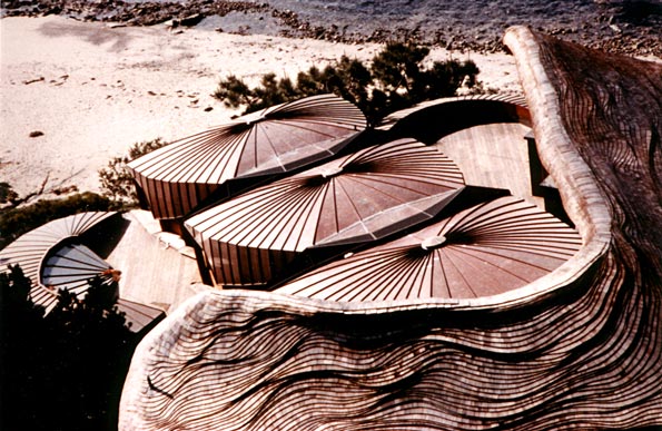
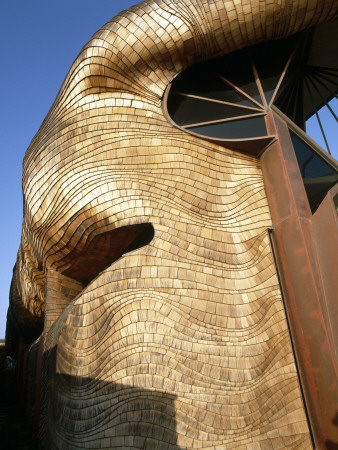
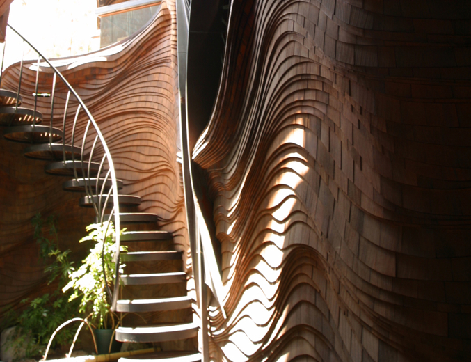
I've got Bart Prince on the brain today. This house he designed, known as the Price Residence, is featured in the book In Search of Natural Architecture and it manages to catch my eye every time I flip through it. The layers and movement in this structure relate to some forms/methods I've recently been exploring with my own work...
The movement of Prince's architecture reminds me of Ben Butler's work, which follows a similar aesthetic... simultaneously spontaneous and strategic..."ARCHITECTURE comes about as a result of the synthesizing by the architect of creative responses to input from the client; data gathered from the site and the climate; and an understanding of structure, materials, space and light. Working from the inside-out, the architect guides the growth of an IDEA resulting from the combination of these responses to a completed design which is as much a portrait of the client as it may be of himself."
- Bart Prince
Friday, February 3, 2012
but is it art?
In gearing up for my TA duties for "Intro to Art Theory," I'm making an attempt to see things from the student's perspective... from the perspective of those who may not be predisposed to admire poop-making machines (see Wim Delvoye) or painfully minimal descriptions of nothing (see Martin Creed) like I am. Being in art school, it's easy to forget that the majority of the viewing public just doesn't "get it." Without an art-historical and theoretical context, much of modern and contemporary art may seem unreachable to the masses who have their their own ideas and preconceived notions of what IS and is NOT "Art."
Below, I've identified a number of categories that tend to be a bit more difficult to digest... especially for a "non-art" audience. The distinctions are not cut and dry, but often seem to blend into one another. They are...
abstract: does not attempt to represent external, recognizable reality but seeks to achieve its effect using shapes, forms, colors, and textures
 |
| Cy Twombly, Untitled VII from Bacchus Series, 2005. |
minimal: set out to expose the essence, essentials or identity of a subject through eliminating all non-essential forms, features, or concepts
 |
| Robert Morris, installation in the Green Gallery, New York, 1964. Seven geometric plywood structures painted grey. |
conceptual: the idea presented by the artist is considered more important than the finished product, if any exists
 |
| Robert Rauschenberg, Erased de Kooning, 1953 (more HERE) |
readymade: created from undisguised, but often modified, objects that are not normally considered art, often because they already have a non-art function
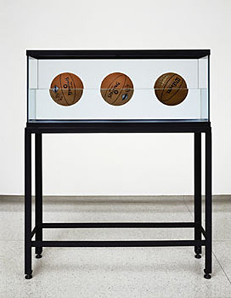
banal: comment on or acknowledgement of that which is so lacking in originality as to be obvious and boring (often overlaps with readymade)
 |
| Jeff Koons, Three Ball Total Equilibrium Tank, 1985 |
process-based: the process of making is not hidden but remains a prominent aspect of the completed work so that a part or even the whole of its subject is the making of the work
 |
| Richard Serra, Splashing, 1968, molten lead splashed into corner and solidified |
performative: the medium is the artist's own body and the artwork takes the form of actions performed by the artist
 |
| Chris Burden, Shoot, 1971, artist shot in the arm in gallery |
relational: takes as its theoretical and practical point of departure the whole of human relations and their social context, rather than an independent and private space
 |
| Félix González-Torres, untitled (Portrait of Ross in LA), 1991, viewers invited to take a piece of candy |
I recently came across this BBC series about Goldsmiths (a famous art school in London) called "But is it Art?" It's made up of two 1-hr episodes (which are both on YouTube). The first follows several MFA students in the weeks leading up to their thesis shows, and the second tracks them in the months following their graduation. I quite enjoyed it... but I can understand why it might elicit some giggles and rolling of eyes. Art school is a curious place... more on that to come...
Thursday, February 2, 2012
Subscribe to:
Comments (Atom)


